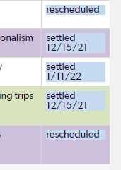
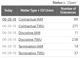
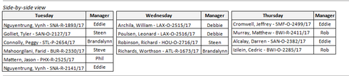
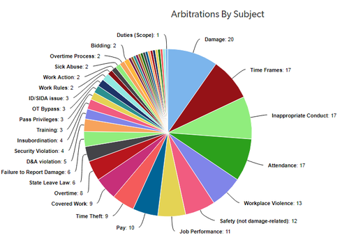
ContributionsMost RecentMost LikesSolutionsRe: Kanban board settingsI think when someone drags-and-drops items on a Kanban board, it's considered the same as if they had just edited that record and changed the corresponding field that the Kanban lanes are based on. So you could potentially modify their role permissions within the app so they're read-only, which would prevent them from making any changes, or you could just lock down that particular field that the Kanban is based on. If you still want them to be able to modify that field in other contexts (like if they click directly into the record) then I'm not sure how to lock it down in just the Kanban report. I think the point of a Kanban, normally, is specifically so that youcan click-and-drag to move items around, as a quicker or more intuitive way of organizing certain information (like the status of certain records). I could be wrong though. ------------------------------ Jake Rasmussen ------------------------------ Color Coding Field so color fills entire cell I used this article to figure out how to color code specific fields. However, in my table report, I also have row-level color coding. My hope was that the row-level color coding would apply first, then the field-level color coding would overrule for the specific fields in question. It appears this is the case, but unfortunately the field-level coloring doesn't color the entire cell background. Instead it only colors the background directly behind the text (similar to if you selected the text via drag selection). In other words, it's acting more like a text highlight then a true 'background' color. Is there any way to get the field-level color coding to cover the entire cell? In the above example, this would mean that entire column would be blue, and you wouldn't see any of the green or purple from the row-level color coding. Re: Save daily totals from a summary report into another table to track totals over timeThanks! Sorry for the late reply, I haven't had a chance to test this out until recently. But it seemed to work!Save daily totals from a summary report into another table to track totals over timeLet's say I have a Summary table that totals all the records in a table where [Status]="Open". These are then grouped in various ways so I have subtotals for the various kinds of records that are open. So far, so good. However, let's say my boss asks me: what were the open totals yesterday? Or the day before? What have the totals been like over time? The Summary table only tells me what they are right now but it doesn't track history, so far as I know. And with the way my data is structured, I don't have a good way of calculating what the open totals wouldhave beenbecause I don't have "opened on"/"closed on" dates to rely on...the only thing that's tracked is the current Status, which is either open or closed. So far I've just been manually keeping track of these totals in another table, where each row/record is a day and each column/field is some specific subtotal. But it seems like Quick Base should have a way of automatically logging this somehow.How can I do this in anautomated way? Here's the summary report. This is what I'd want to automatically log each day. This is how I've been manually tracking the daily totals. Re: Display two summary table reports side by side on dashboardI've got a dashboard setup with three nearly-identical reports side-by-side (just showing different days) but I still have issues with excess white-space. Any tips? Ideally I'd like to create something sorta like this: (This was just a table manually created in an email in Outlook. The left column on all those is the same field, it's just titled different for each day) I created a report in QB showing the same fields, and I can get it to group by days but everything is stacked on top of each other, like a table normally is. Is there a way to show columns of columns? In other words, something like this: Not sure if it's possible in a single report, so I tried creating three different reports and putting them side-by-side in a dashboard like so: The problem is if I want to print this I have a ton of space wasted from the left-most column on each report, the empty column where the record actions would be (i.e. the new/updated flags), not to mention the overall space between the individual reports. Is there any way I can get this tighter, or somehow show this same thing on a single report rather than a dashboard?Re: Positioning of Data Labels on chart when filteringThanks. I created a Support Case.Positioning of Data Labels on chart when filteringHi, I noticed that my pie chart data labels are acting wonky when I filter the data. As the results change and the chart shifts to show the filter, the data labels are not repositioning themselves correctly. They seem to move around a little bit but they don't seem to move to the proper position (i.e. as close to their slice on the pie as possible). This causes the leader lines for the labels to stretch awkwardly around or through the pie chart, making it harder to tell what label goes with what pie slice. Is this normal? If not, how do I avoid it? Here's the chart normally, unfiltered: And here's what it looks like as I start filtering down. Notice how the data labels on the left side are bunched up and how the leader lines are stretching to reach the proper labels. If you look at the bottom where "Job Performance" and "Safety" are, itdoesreposition them from one side to the other, which means Quickbase is still dynamically re-positioning the labels depending on how the chart is being filtered. But if that's the case, what's causing the labels in the bottom-left to bunch up like that and stretch out the leader lines? Why won't it reposition the labels clockwise up the chart since there's room now?