
Blog Post

DeepaPrashant1
9 months agoQrew Assistant Captain
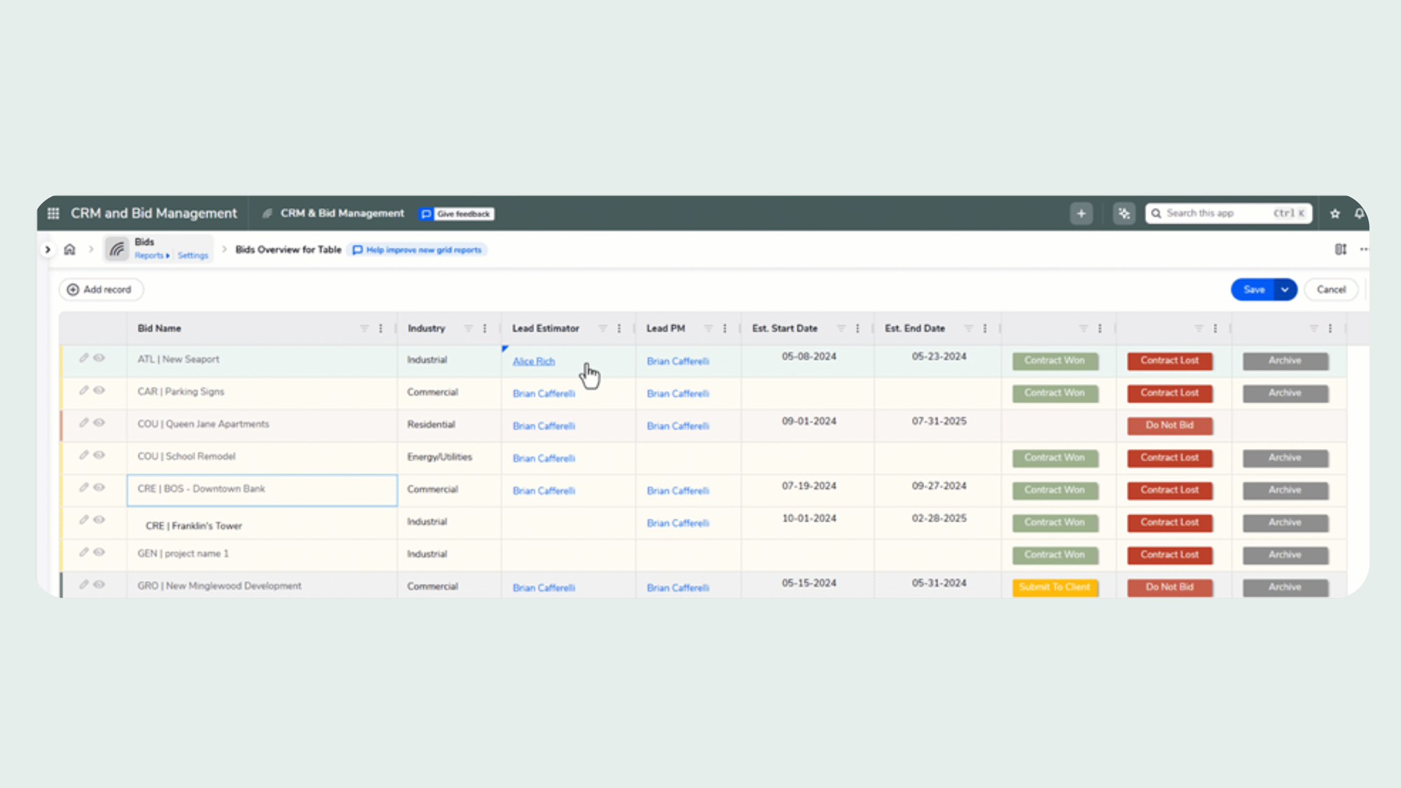
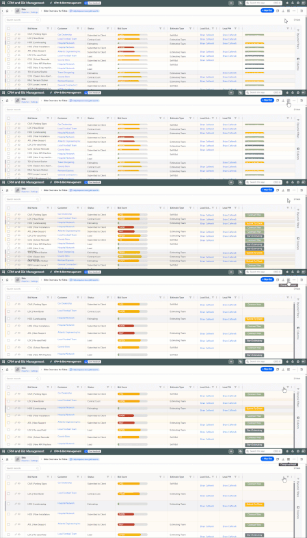
I love the concept but the visuals need to be improved. I like the old grid edit report look better. The header had a gray background with the headers in white showing prominently and the header wrapped itself and so did the data in the column. Now nothing is readable as nothing wraps and columns to the far right can not even be expanded as one cannot reach the edge of the column to capture and expand. For now, I have reverted to the old grid edit.